Inspire
A social media platform for creatives, created by creatives.
The Problem
Many social media platforms do not provide a convenient, all inclusive space to showcase artwork, music, and video works, focusing on engagement instead of providing useful, customizable spaces to artists, musicians, and creators.
Goals
Designing a mobile app that allows users to organize their own “gallery” style profile page, access a feed of followed and recommended creators, and search for creators by medium as well as other criteria, will provide users with a unique social media experience that caters to creative minds.
Research
By using applications such as Twitter, Instagram, Tumblr, and Mastodon, as well as asking those in creative fields questions about what would provide a social media platform that caters to their needs, I was able to gather criteria to guide my design process.
User Persona
I created my user persona, Alex, based on information gathered about various creatives both in my social and academic circles, as well as online. I wanted to include the various operating systems that people may access the platform from, as well as their individual needs in order to ensure that the app’s design stays focused on this unique user group.
Sketches
This project came to fruition as part of a group assignment in an iterative design course, and me and my teammate began the process of creating the app by sketching ideas and presenting them as a paper prototype for feedback.
Lo-Fi Prototype
After receiving feedback from our professor as well as classmates, we were able to begin working on our Lo-Fi prototype, creating wireframes to solidify our app’s layout.
We focused on using simple, recognizable gestures and buttons, in order to create an app that both creators and those looking for artwork could pick up and use without any need for a tutorial or instruction.
Initial Hi-Fi Prototype
After recieving largely positive feedback on these designs, we created our final, Hi-Fi prototype, and named the app Inspire. I focused on creating the feed and the gallery page, and Valeria focused on creating the search and browsing functions.
The feed allows users to view posts, repost them, love them, and comment on them, as well as view each post’s title. The minimal approach focuses on the work showcased in each post, rather than on text or other clusters of information.
The gallery function is a key feature of Inspire, as it allows creators to customize their pages to highlight works, bios, text, and other blocks laid out in any way they may desire. This allows creators to both showcase their portfolios as well as find other artists on the same platform.
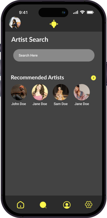
The browsing and search functions allow users to find creators based on location, medium, and genres, allowing users to easily discover creators that they otherwise may not have encountered through traditional social media browsing.
Updated Hi-Fi Prototype
Wanting to refresh the initial designs, I found new icons that more clearly indicate actions and fit more cleanly into the app’s design. I also updated the search functionality to be more familiar for users.
By separating elements into blocks, content is easier to parse, and pops visually in comparison to the rest of the content.
Combining the previously developed search flow based on recommendations and art medium with a more traditional search bar allows users to easily browse and explore artist profiles.
Conclusion
This project helped me to further my skills in UX by observing how features worked for some users in some applications, and did not work for others during research, and informed my design decisions. I was also able to learn more about creating prototypes in Figma, and refined my process of finalizing design projects.


