UCCS MBA Homepage
This project was completed for a UX Research course at UCCS, with UCCS serving as the client. During this project, I was able to successfully work with team members to conduct a usability test, analyze results, and present findings in a usability report and presentation.
Purpose
This research study was conducted for the UCCS MBA page as part of our UX Research course, to evaluate the usability of the page, as well as the user’s experience of the current page layout. It focuses on evaluating the ability for users to access financial aid information, program information, the UCCS application, and the touring page.
Research
By interviewing a usability expert at UCCS, Olivia McDonald, we were able to gain insights as to what demographics to use to guide our persona creation, as well as our test creation. We also performed further research into what prospective MBA students value, and were able to tailor our persona to this information.
User Persona
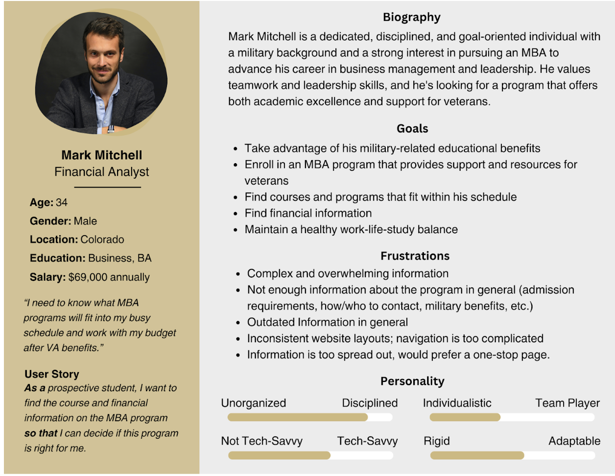
We created our persona, Mark, using our research, and were able to guide our testing based on its characteristics. We wanted to focus on those that are from 25-35, and emphasize that while these people are able to navigate technology, they can struggle with more complex systems and will not want to waste time on not being able to find information.
Methodology
We administered tests to 5 participants, and while they were not aligned with our primary user persona, we believed they would help to broaden research on the functionality of the UCCS MBA homepage.
The tasks were:
1. Explore the UCCS MBA homepage
2. Locate the request information form
3. RSVP for a campus tour
4. Locate information on how to apply
5. Locate the financial aid options for MBA students
Findings
From our usability testing, we found that the most frustrating task for our participants was task 5: locating the financial aid options for MBA students. Four out of five of our participants gave up on this task after around 2 minutes of trying. Our second most difficult task for participants was task 3, RSVPing a tour, with one user unable to access the page, and two others experiencing difficulties accessing the page.
Additionally, many participants expressed that the page layouts are inconsistent, making it hard to navigate the website, and are accompanied by large walls of text that make it difficult to find the information they are looking for.
Usability Recommendations
Based on these research findings, we were able to recommend the following solutions:
Provide relevant and detailed content, such as financial aid information, and remove unnecessary information.
Provide easier access to the touring page from the MBA program’s page.
Reduce the amount of information presented in large text blocks, making it easier for users to scan for information.
Optimize navigation flow by creating consistent page and content designs.
Conduct regular usability testing to address usability issues as they arise.
Conclusion
Through this usability report, I was able to gain valuable knowledge in conducting user testing and analyzing data, as well as gain further experience in successfully working for a client in a team setting. I was able to work with team members to successfully develop usability recommendations by analyzing both qualitative and quantitative data.
